World of Warcraft is changing its character creation screen for the first time in a decade and I hate it
The old character creation process wasn't great, but this new one isn't much better.

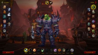
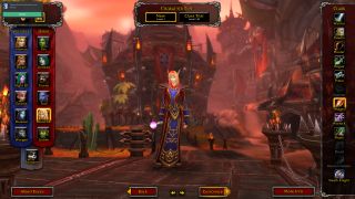
It's been over 15 years since World of Warcraft first launched and it's starting to show its age. The character creation screen, for example, hasn't changed much through that entire time despite the addition of new playable races, classes, and a ton of expanded ways to customize your appearance. But yesterday, the closed alpha test client for this summer's Shadowlands expansion was updated to add some minor new features, including this unexpected change to how character creation works. You can see the new version in the image above. I really don't like it.
If you're unfamiliar with the old version (there's a screenshot below so you can compare the two), the biggest difference is how everything is laid out and presented in a more minimalist way. Instead of race selection being on the left, the Horde races are now featured on the right side of the screen. The upside to this is that now you don't have to go to a whole different menu just to see Allied Races, special variants of the core races that players unlock through various means.
It's nice having all the different race options available on one page, but the whole rework gives me serious mobile game vibes. The circular character portrait buttons just feel like something I should be pressing with my thumb, not clicking with a mouse, and instead of feeling minimalist, I find the new menu feeling empty.
Customization options are also changed too. Instead of scrolling through a panel that visually displays each option, like different hairstyles, there are now sliders you adjust for each part of your body. Again, it just doesn't look very good to me.

I'm not the only one who isn't crazy about the new look, either. Over on WoW's subreddit, user 'freeflame18' said the new look is missing "a lot of soul" and did some photoshopping to bring back some of the visual elements from the original character creation screen.
But maybe I'm just being unfair. It doesn't really matter anyway since character creation is a process you maybe spend two minutes on and then never think about for months until you decide to make a new character. So even if this version doesn't change over the course of the alpha and beta test and ends up being the one that ships alongside the Shadowlands expansion this summer, it's not a big deal.
What do you think of the new redesign?
The biggest gaming news, reviews and hardware deals
Keep up to date with the most important stories and the best deals, as picked by the PC Gamer team.
With over 7 years of experience with in-depth feature reporting, Steven's mission is to chronicle the fascinating ways that games intersect our lives. Whether it's colossal in-game wars in an MMO, or long-haul truckers who turn to games to protect them from the loneliness of the open road, Steven tries to unearth PC gaming's greatest untold stories. His love of PC gaming started extremely early. Without money to spend, he spent an entire day watching the progress bar on a 25mb download of the Heroes of Might and Magic 2 demo that he then played for at least a hundred hours. It was a good demo.
Most Popular


