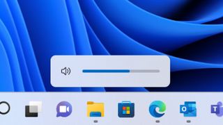
Windows 11 is finally getting a volume pop-up to match its sleek aesthetic
Wave goodbye to Windows 10's boxy brightness and volume indicators.

That clunky square volume slider that appears on your screen every time you change the volume isn't very Windows 11. The new OS shuns everything with a sharp corner, and that little volume indicator is as sharp as they come. So, Microsoft is replacing it with something a little more artsy in the upcoming Windows build.
The Windows 11 launch has been a strange ordeal. It arrived as a half-baked OS overhaul that we weren't sure was worth rushing out to download at the time. It is slowly trudging towards being a fully-fledged OS in its own right, however, and with each new Windows update we receive one or two changes to make it feel a little more complete.
The latest: new flyout (as Microsoft likes to name its on-screen indicators) designs for hardware indicators, including volume, brightness, camera privacy, camera on/off, and airplane mode. All of which will abide by your choice of light or dark mode.
That's pretty neat, then, as the existing volume and brightness indicators are definitely out of place amongst the translucent and curvaceous windows of Windows 11.

Windows 11 review: what we think of the new OS
How to install Windows 11: safe and secure install
What you need to know before upgrading: things to note before downloading the latest OS
Windows 11 TPM requirements: Microsoft's strict security policy
This new update has just landed in the Windows 11 Insider Previous Build 22533, but should make its way out to the public Windows 11 build before long. This update all incorporates a bunch of general fixes that Microsoft will want to get out there sooner rather than later, and it also crucially allows users to uninstall the Clock app, should they so wish.
So is Windows 11 now worth downloading with this volume indicator shakeup? You'd think that would be the most obvious reason to change, but then again, perhaps not. Still, I've made the switch on both my personal PC and laptop, and I'm liking it so far. Besides a few visual glitches, such as a taskbar with no icons on my secondary monitor, and maybe the odd double system tray, it's actually been a rather painless experience.
And Windows 11 does look nice. Potentially a little nicer with a matching volume indicator, too.
The biggest gaming news, reviews and hardware deals
Keep up to date with the most important stories and the best deals, as picked by the PC Gamer team.

Jacob earned his first byline writing for his own tech blog. From there, he graduated to professionally breaking things as hardware writer at PCGamesN, and would go on to run the team as hardware editor. He joined PC Gamer's top staff as senior hardware editor before becoming managing editor of the hardware team, and you'll now find him reporting on the latest developments in the technology and gaming industries and testing the newest PC components.
Most Popular


