Why I love Stellaris' slick interface
Good tooltips, clear icons, nice fonts and an excellent galaxy map smooth out Stellaris' opening hours.


In Why I Love, PC Gamer writers pick an aspect of PC gaming that they love and write about why it's brilliant. This week, Tom enjoys Stellaris' thoughtful UI.
Big complicated strategy games live or die on their UI. Too much information puts off new players, not enough information handicaps players, and the line between 'too much' and 'not enough' changes from person to person.
It's particularly tricky for 4X grand strategy games, because they tend to offer little in the way of immediate reward; your opening experience tends to be a wrestling match with the UI. You have to wander blindly through dozens of menus to learn how a dozen different resources and icons interact. Normally the first fun thing you get to do is scout new areas. Even if significance of your discoveries aren't initially obvious, uncovering a map and widening your playspace feels good.
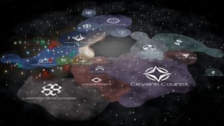
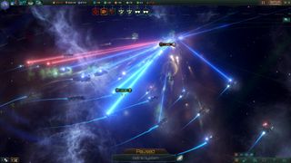
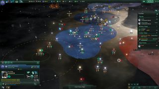
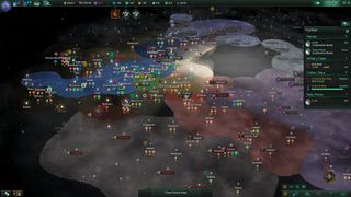
A good interface eases you into this scouting phase quickly, while still showing you essential information that stops you from making stupid mistakes. Stellaris—specifically Stellaris' galaxy map—does this brilliantly. You start in a solar system, micromanaging scouting vessels and learning the game's systems on a small local scale. Once you've grasped that, you discover that you can manage almost everything you need to on a galaxy-wide scale from a single screen. It looks like this:

This still looks like a lot of info, but it's beautiful to use. Ships in a system are represented by small green ship icons; you can select them directly or pick them out of the taskbar on the right. With a ship selected you right-click on any star or anomaly—represented by a yellow exclamation mark—to get a context-sensitive list of tasks the ship can perform there.
Once a task is underway, a completion bar appears in the right-hand task bar that describes exactly what the ship is up to, while also giving you an impression of how long the task will take. It sounds simple, but few strategy games make the process of moving pawns around to execute moves this clear and easy. It's a long way from Paradox' overwhelming strategy games, Crusader Kings 2 and the Europa Universalis series. Stellaris shows you exactly what you need to know using the familiar language of operating systems—right-click menus, loading bars, and so on.
Resource management is also excellent. Once you've scouted a system its resources are listed with an icon and a number under the node on the galaxy map. To exploit resources you need to build mining and research stations. If a resource point doesn't have a station attached, it appears in white on the galaxy map. Once you've built a station, the number turns green. It's a small but brilliant bit of design. You can glance at your entire empire and instantly know what you need to build where.

The game is also excellently tool-tipped. You can mouse over anything for an explanation, and hold the mouse-over for extended tooltips. Sometimes if a tooltip thinks you might want more specific information, it tells you what to point at to get that info. For example, ship upgrades come in small, medium and large varieties. Mouse over the weapon image and it tells you what the thing does, before directing you to mouse over the small, medium or large item icons to get specific stats for each variation. Beautiful.
The biggest gaming news, reviews and hardware deals
Keep up to date with the most important stories and the best deals, as picked by the PC Gamer team.
These seem like tiny things, but they make a huge difference to the flow of a data-driven strategy game. I've only been playing Stellaris for a few hours and controlling my empire has become second-nature, and I'm not wrestling with menus set within menus. That means I have more time to think about strategy, and whether that faction of space turtles is about to turn on me or not.
Part of the UK team, Tom was with PC Gamer at the very beginning of the website's launch—first as a news writer, and then as online editor until his departure in 2020. His specialties are strategy games, action RPGs, hack ‘n slash games, digital card games… basically anything that he can fit on a hard drive. His final boss form is Deckard Cain.

If you love big trucks, establishing trade routes, and the phrase 'post-apocalyptic survival business simulator' then I've got just the strategy RPG for you

Blizzard veteran David Kim's strategy comeback with Battle Aces is 'very personal:' 'I just can't accept... the end-all peak of RTS is StarCraft 2 and nothing can ever be better'
Most Popular


