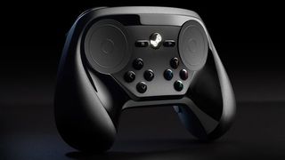
Valve reveals redesigned Steam controller with analog button arrays

Valve has been deliberately iterating on the Steam controller for months now, trying to find that perfect balance between gamepad simplicity and keyboard-and-mouse precision. At Steam Dev Days in January , Valve announced the biggest change to the controller since we first laid eyes on it: the centered touchpad was gone, replaced by two diamond-pattern four-button layouts.
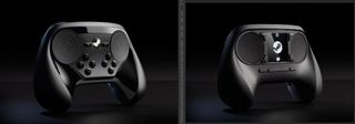
At the time, we only had a rough mockup to go on, but now Valve has shown off the real thing, along with a promise that the Steam Controller will be on display at Valve's booth at the Game Developers Conference next week. Check out a side-by-side comparison with the previous iteration below.
In January, we reported that dropping the touchscreen in favor of button was "made to improve backwards compatibility and keep people focused on the big screen with the game on it, rather than the little screen with the controls on it." The touchscreen would have been more configurable, but the new button arrangements are far more familiar staples of game controller design.
Valve's announcement email for the new controller notes that the buttons are analog, but doesn't offer any other details. We'll be at GDC next week to take a closer look at the revamped controller.

The biggest gaming news, reviews and hardware deals
Keep up to date with the most important stories and the best deals, as picked by the PC Gamer team.

Wes has been covering games and hardware for more than 10 years, first at tech sites like The Wirecutter and Tested before joining the PC Gamer team in 2014. Wes plays a little bit of everything, but he'll always jump at the chance to cover emulation and Japanese games.
When he's not obsessively optimizing and re-optimizing a tangle of conveyor belts in Satisfactory (it's really becoming a problem), he's probably playing a 20-year-old Final Fantasy or some opaque ASCII roguelike. With a focus on writing and editing features, he seeks out personal stories and in-depth histories from the corners of PC gaming and its niche communities. 50% pizza by volume (deep dish, to be specific).
Most Popular


