The worst bullshots in PC gaming
We look at some of the funniest and most misleading marketing screenshots in recent memory.

It’s one thing to pull a still from a movie that accurately represents how the final cut will look and feel, but videogames are another matter. Trailers and screenshots are put out well before the game is complete, which means they’re inevitably going to need visual band-aids here and there, and communicating everything the game is trying to achieve—systems, story, style—in a single frame is difficult. Enter the bullshot.
To make their games look as good as can be, some publishers pose characters and snap screenshots with a free camera, sometimes even downsampling from high resolutions to reduce aliasing, or using Photoshop to make them pop just a little more. While these marketing screens convey key information and look nice, they can be misleading . We’ve gathered a few of the worst offenders in recent years—in part because they’re funny, but also because it’s a practice that should be called out. We’d much rather see what a game actually looks like to play, especially when these screenshots appear on a store page. Leave it to us to take the unrealistic screenshots after release, because we love doing it.

The Witcher 3
Click here for a higher resolution.
Even our favorite games aren’t excused from bullshot shame. The Witcher 3 is a damn good-looking game, but to get shots resembling this quality we had to take them at 3840x2160—which we doubt many players can do at a playable framerate—using a mod to enable a free camera and console commands. Also, who the hell is that horse because it sure isn’t Roach. Impostor resolution, impostor horse—get out of my computer.
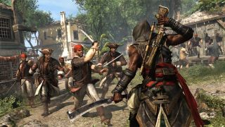
Assassin’s Creed 4: Black Flag - Freedom Cry
Click here for a higher resolution.
This screen wouldn’t be a huge offender if not for the clearly posed gang of pirates. Each has their own stance. I like pointing guy on the far left. What’s he trying to do? Buddy, you’re at the rear of the pirate pack and all your dudes already know where the assassin you somehow just spotted is. But maybe he’s just a stickler for photo balance, a guy who can’t help but obey the rule of threes. That’s some good AI.
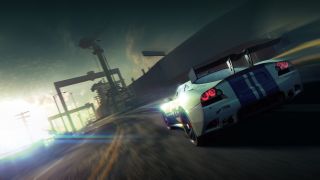
Split Second
Click here for a higher resolution.
Racing games tend to be the biggest bullshot culprits. Take Split Second for instance. It’s a great looking game—most racing games nowadays are—but this shot looks like someone just discovered Instagram filters. I love a good filter, but this one turns up the warm colors and vignettes with reckless abandon. Look both ways before you cross the street because it’s blurred to hell.

Borderlands 2
Click here for a higher resolution.
Gearbox tends to eliminate aliasing by taking the shots at a super high resolution, but to really make their images pop, contrast is turned way up. It makes the comic book stylings much more apparent, especially because detailed textures are used throughout the entire image, no matter how far objects are in the distance. With everything in such clear focus, it makes the image look flat.
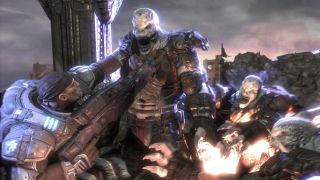
Gears of War
Click here for a higher resolution.
I’m not sure what kind of holy light exists just offscreen in every other bullshot, but it’s not working well to bring out this central locust’s best features. It makes even less sense when you notice that the blinding light is coming from the hole in the ground at the bottom right. Besides the awkward blur and focus muddying half the picture, I can’t figure out what’s going through that locust’s head. Is Marcus holding it up with a light grip on the shoulder? Impressive. Is that shock or rage or is that just how their jaws always are? These are the questions Gears of War 4 needs to answer.

No Man’s Sky
Click here for a higher resolution.
This one’s a toughie. This shot from No Man’s Sky isn’t touched up, but it uses assets that aren’t representative of what the final game produces. In my experience, the creatures look like remixes of a handful of variables and characteristics after 10 or so hours in, and vegetation can’t grow that tall without the use of mods.

Far Cry Primal
Click here for a higher resolution.
The biggest giveaway here (not that you need one) is what I’ve dubbed the Holy Mammoth. Before the rise of modern religion, there was the One True Mammoth, from which all bloom lighting emitted. It seems to have blessed the screen with an abundance of golden light, impossibly smooth edges, and perfectly posed figures.
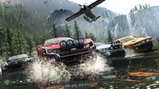
The Crew
Click here for a higher resolution.
It’s rare to find a racing game screenshot that wasn’t taken at some forbidden, transcendent resolution, so I have to hand it to The Crew with this one. That said, this shot is posed beyond reprieve. Four cars, perfectly aligned to frame up nicely and balance out the shot with a lovely airplane cherry up top.
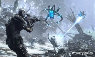
Crysis
Click here for a higher resolution.
I won’t be too harsh with Crysis since it’s still the go-to for good-looking PC games in some respects, but the soldier getting lasered is impossible to ignore. It looks like he’s waving hello to the tentacled aliens above, though I suppose his pose is meant to imply he’s flying backwards due to the force of the white hot laser blasting a hole in his chest. Either way, Crysis isn’t capable of such a believable ragdoll animation, but I suppose a twitching bundle of human appendages doesn’t look so good in still life.
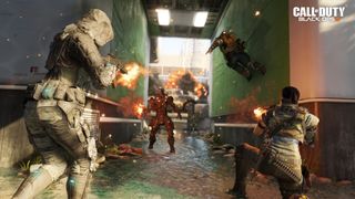
Call of Duty: Black Ops 3
Click here for a higher resolution.
I think future soldiers will be smarter than this. I figured future war would entail guns that can fire from far away and not meeting in the middle of a short corridor for shootouts. Instead, we have two soldiers firing into a stoic mechanical man and another presumably about to kick their head in. My favorite detail? That explosion in the background lost in the shallow focus. While the Black Ops 3 might look this good, it’s rarely this nonsensically positioned.
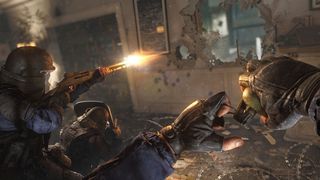
Rainbow Six Siege
Click here for a higher resolution.
Here we have another checklist shot trying to show off as many systems and features as possible while still looking pretty. We’ve got destructible walls, a shielded player, a shotgun firing, a grenade, some barbed wire in the bottom right, and some pretty detailed textures. Problem is, the final game doesn't look nearly as nice, and while the destruction is fairly granular, it’s not to the level of detail expressed in this screen. Look at all those tiny individual perforations. If only.
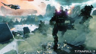
Titanfall 2
Click here for a higher resolution.
I played this scene just over a week ago and it looked great, but not like this. The scene glows an icy blue and the blacks are super deep. Someone turned up the contrast. Also, who’s kicking up all that damn dust? It doesn’t look natural, like it’s being used to balance out the color and weight of the shot.
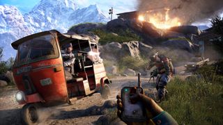
Far Cry 4
Click here for a higher resolution.
There’s so much going on in this shot it feels like one of those hidden object pages from Highlights magazine. Let’s see, we’ve got a three-wheeled buggy thing, a dude with an easily readable expression shooting out the vehicle’s side, we can see two bullets in the act of ricocheting off the soldier, a truck in the far right, a building on fire above, some gorgeous snowy mountains in the background, a remote detonator in the player character’s hand—and it’s all in perfect focus. No jagged edges, some nice airbrush effects on the wheels to imply motion. This is an ascendant bullshot. This is art.

James is stuck in an endless loop, playing the Dark Souls games on repeat until Elden Ring and Silksong set him free. He's a truffle pig for indie horror and weird FPS games too, seeking out games that actively hurt to play. Otherwise he's wandering Austin, identifying mushrooms and doodling grackles.
Most Popular

