The making of Bioshock's twisted green belt, Arcadia
Inside development of one of Bioshock's most complicated levels.
This article was originally published in PC Gamer issue 319. For more quality articles about all things PC gaming, you can subscribe now in the UK and the US.
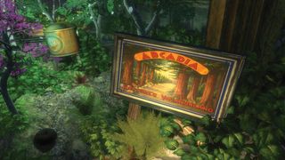
Fort Frolic—BioShock’s lavish setting for Sander Cohen’s Snapchat murder gala—tends to be held up as that game’s standout level. It sits about halfway through the game, and I can’t deny that the anticipation of reaching it is a joyous thing. But encountering Fort Frolic would be nowhere near as satisfying without the verdant lead-in of the player’s exploits in the overgrown botanical environment of BioShock’s fifth level, Arcadia.
In Arcadia, players must steer luckless lead character, Jack, through Rapture’s principal arboreal leisure and agricultural hub—its lungs ‘n’ larder if you like. But how does the level actually work from a design perspective and how does it augment your trip to the neon murderfest of Fort Frolic?
Level designer J.P. LeBreton outlined three key requirements for Arcadia, as laid out by BioShock’s writer and director, Ken Levine: 1) Arcadia is where Ryan kills off all the plants in an attempt to kill you, 2) you’re locked in until you can fix it, 3) there’s a scientist there who helps you restore them.
“Aside from the initial brief, I had a lot of freedom to lay out the level and orchestrate as needed,” remembers LeBreton.
The world you’ve encountered prior to Arcadia has been one of greeny-blues, shiny brass and, in the case of the preceding fourth level, Smuggler’s Hideout, grey rock. Arcadia is thus able to make an immediate impact on players simply by switching up the colour palette.
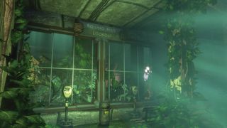
Vibrant greens predominate, punctuated by the pinks and orangey yellows of water lilies, or pinkypurple tree blossom. LeBreton has previously said the idea was “to truly shock the player with the strange sight of an underwater forest”, but he tells me that this makes it sound more intentional than it was.
The biggest gaming news, reviews and hardware deals
Keep up to date with the most important stories and the best deals, as picked by the PC Gamer team.
“So many things in game development are opportunistic, run-with-it type affairs. Once the visual identities of the fisheries and the submarine bay in the preceding levels became clear, and once we decided the player would be entering Arcadia not via a bathysphere station but via a tunnel into the lush cemetery and tea garden, it was obvious we had an opportunity for a surprising visual moment.”
Visible roots
LeBreton is candid in describing Arcadia’s earliest iterations, starting with the rough geometric space he outlined in March 2006. “I was still a pretty inexperienced level designer when I started building it,” he explains. “This was the first massive singleplayer game I’d worked on.”
Initially the shape of the space was influenced by the idea that BioShock would be a spiritual successor to System Shock 2.
“What I was interested in specifically were some of its connections to the level design of the first two Thief games (which shared some personnel with both [System] Shock 2 and BioShock), which were very sprawling, twisty and strange in places. Not much of that survived into the finished product, other than the fact that the level is still kind of hard to navigate.”
Over the summer of 2006 the level was rebuilt piece by piece, mostly by the 2K Australia art team, to reorganise the space. One key edit was to tweak the scale of the Tea Garden, for example making the corridors you move down roughly twice as wide. The main addition to the space involved splicing the entire Arcadia Glens central connecting hallway into the existing layout. The idea was “to separate the areas from one another and establish that hierarchical navigation-type idea”.
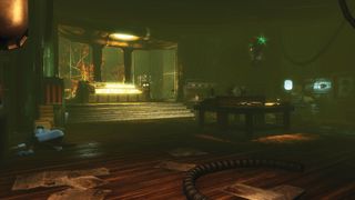
“The rebuild kept everything I liked about the layout while simplifying it, and I made plenty of changes once they handed it back so my sense of ownership wasn’t really disrupted. I still have attachment to the weird intricacy of those early builds but I think 2K Australia’s revisions were vital to getting the map on a good path to ship.”
That seems especially true of the addition of the Arcadia Glens hallway. “It created a backbone whereas before the level had been an amoeba-like cluster of organs,” explains LeBreton. “When you have a central thoroughfare, you can put signs on it, pare it down to keep the player moving ahead if you want, or tempt the player off it when you want them to hit an objective or explore for a while.”
Doors of perception
With numerous nooks, crawlspaces and subareas radiating out from Arcadia Glens, there are a lot of doors occupying a tight space, including some you won’t be able to open until later in the level. That can be a confusing experience for the player.
“Whatever confusion the layout we shipped caused, the earlier versions of it would have been even more confusing, I think,” notes LeBreton. He also points out that although having so many identical doors can induce a kind of choice paralysis in the player, they also offered a technical benefit.
“The heavy use of doors in Arcadia and other parts of the game was partly an answer to technical constraints: our doors could block rendering behind them when fully closed, so if framerate was poor in an area, adding a door could potentially fix that problem quickly and easily.”
To go back to Ken Levine’s requirements for Arcadia, this section of BioShock would need to trap the player while they fixed a problem (the problem here being uberjerk Andrew Ryan attempting to poison all the plants and suffocate your character via toxic gas).
I ask LeBreton if there was some sort of formula he applied when balancing Arcadia’s architecture and events so that the player is engaged in what’s going on, but not overwhelmed. “On the player’s initial trip through an area, you do the conventional Half-Life 2-style pacing where you alternate relative safety and exploration with combat encounters of varying intensity,” he says. “The return trips used a repopulation system to keep parts of levels from feeling too empty, though we would still augment this with scripting as needed.”
But it was the plant die-off caused by gas which presented the biggest technical challenge in Arcadia. The solution was “a totally opportunistic use of existing tech”, says LeBreton.
Scripting, in this instance, could mean a fight between Splicers which the player would stumble upon, Splicers lying in wait for players, or even fights staged near a Big Daddy to amp up tension for players as they tried to avoid angering it.
“There was also the security system; as you re-enter Arcadia proper from the Farmer’s Market, I scripted a security alarm that summoned a higher than usual number of flying robots, to accompany an Andrew Ryan radio message that makes it clear the level of antagonism is ramping up to the level’s final siege.”
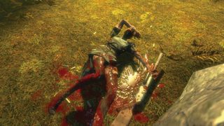
But it was the plant die-off caused by gas which presented the biggest technical challenge in Arcadia. The solution was “a totally opportunistic use of existing tech”, says LeBreton. “The original design for Bioshock included a ‘pressure’ system, where you could change the pressure in zones and it would alter the gameplay, making certain enemies and weapons more or less effective.
“This pressure system, implemented and mostly abandoned before I even started Arcadia, could also control lighting and fog in different regions. As soon as the idea of ‘Ryan kills off the trees to cut your oxygen’ emerged, we realised we could use that system to make it a dramatic visual change. There was a bit of tech work to support how I wanted to use that system in Arcadia, but overall the level’s tech needs were pretty light.”
Paradise regained
The regrowth effect you see once you’ve released the Lazarus Vector into the atmosphere was mostly the work of 2K Boston’s FX artist Stephen Alexander. Alexander painted a custom mask that would appear to change as an index value moved from 0 to 1. “It’s probably a common FX/shader trick now but it was the first time I’d seen it in 2006/7,” says LeBreton. This same technique by Alexander is also used to create the effect of botanist Julie Langford writing a safe code with her finger on a fogged up window.
The dying off of the vegetation in Arcadia reveals the mysterious symbolic daubs of the Saturnine cult etched on the walls and a few formerly unreachable cave areas where these heavily spliced-up cult members meet. “The Saturnine were a fairly late addition, and their main value was to enrich the area’s backstory,” LeBreton previously explained. The idea was that these were a group of frat boys or businessmen who had gone feral, cribbing pagan imagery from pop culture and taking weird Plasmids.
These Saturnine are a version of a type of enemy introduced during Arcadia; Houdini Splicers. Houdini Splicers can turn invisible, relocate during a fight and throw fiery projectiles. Of their introduction, LeBreton points out, “Before the player knows exactly how something works, you can tease them with incomplete information about it, let them form theories for a bit, before whisking the cloth off and making it a gameplay mechanic they’ll see many more times.”
According to LeBreton’s own Vector Poem blog, the Houdini Splicers required some complex scripting. “The AI itself has zero concept of ‘teasing’, so there are multiple instances of the first Splicer you encounter that gets destroyed and respawned at different places. Field-of-view-based triggers know whether or not the player has seen a given part of the tease.”
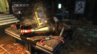
Accompanying this new variant of foe is a new type of weapon; the Chemical Thrower.
“Most games with a certain number of weapons and abilities plan out the introductions of each new tool with a schedule or ‘power ramp’ as it’s sometimes called,” explains LeBreton. “For Arcadia we knew we wanted to introduce the crafting system, the one or two remaining new Plasmids and, originally, a weapon called the BioWeapon.
“Later the BioWeapon was cut (its effects were turned into the Enrage and Insect Swarm Plasmids) and replaced with the Chemical Thrower, which still happened to make sense given the level’s theme. Aside from introducing Insect Swarm in the Apiary area, I didn’t do much special design work to cater to these new abilities; by that point in the game the player knows the ropes so it’s more about giving them lots of space to play with the tools.”
Wave lengths
The level’s intense finale sees the player fight off the Splicer hordes while the Lazarus Vector revives Rapture’s plant life and oxygen supply. The ambush actually shares a scripting system with events in two other BioShock levels; Medical Pavilion and Fort Frolic.
The scripting system for BioShock and Bioshock 2 was “a bit quirky” but “it provided enough flexibility that I was able to use my still-developing programmer brain and define logic for spawning and managing waves,” explains LeBreton. “After a few iterations and having people on the team play my test level, it felt good enough to depend on for a climactic battle or three.”
The end result was based around waves. “There are a certain number of filler enemies (melee Splicers, mostly) in these waves, their spawn locations are chosen from a few points and trigger when the player isn’t looking at one of those points, and when they die that goes towards the ‘cleared for this wave’ total.”
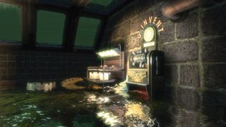
When they meet the wave total, the player gets a chance to catch their breath and then faces a new wave. “Additionally, a specific Houdini Splicer was spawned for each wave, and maybe two for the final wave—we considered these enemies tough enough that we did not want an open-ended number of them spawning.”
Once the system had been fine-tuned and was working well in Arcadia, LeBreton turned it into a ‘prefab’ (“not unlike the modern Unity engine concept of prefabs”). This meant that fellow designers Paul Hellquist and Jordan Thomas could utilise it in their own BioShock levels (Medical Pavilion and Fort Frolic respectively) and just tweak a few settings to ensure it matched the levels’ position on the game’s difficulty curve.
“This system also formed the basis of the Little Sister Gathering Ambush system that was in BioShock 2,” adds LeBreton. “Wave-based enemy spawning is pretty common so it’s not like some tech innovation or anything, but like I said I was still learning to think like a programmer and was proud that I was able to make something that was useful to the rest of the team.”
Given Arcadia came so early in LeBreton’s career, I ask what he would do differently if he was designing the same space today, with a decade of experience behind him.
“Simply put, it would be easier to find your way around but also more full of interesting exploration,” he says. “The map we shipped was, I think, in a bad middle ground between too complicated for a console FPS in 2007, and not weird and sprawling enough to stand among the greats of immersive sim level design à la Constantine’s Mansion from Thief.”
Summing up his time working with Arcadia, LeBreton describes it as a series of layers, accumulating to build a space which felt real. “The early builds, the later builds, and what we shipped are all kind of overlaid atop one another in my memory, and all the personal interactions and difficulties and (eventually) triumphs live in those spaces as well.”
Most Popular

