The eight ugliest PC gaming cases we've ever seen
These fabulous PC cases will make you cringe.
Tuan wrote an article earlier this year talking about how gaming hardware needs to grow up. The discussion revolved around the use of “gaming” as an adjective in the PC component space, and the oftentimes ridiculous design language that accompanies it. The biggest offender of horrible designs however, has to be cases.
Thankfully, most case manufacturers have matured quite a bit over the last decade to spare new builders the horrors of PC gaming design’s darkest hours. I say that figuratively of course, seeing as how plenty of PCs in the early 2000s were filled with cold cathode bars emitting enough fluorescent lighting to illuminate a nightclub. But to really appreciate how far we’ve come, it’s important to take a look at the bad. Here’s a list of some of the ugliest PC gaming cases history has ever seen.
NZXT Guardian

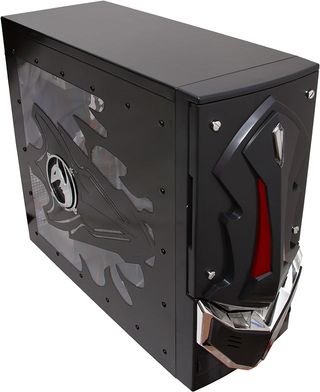
NZXT has created some of our favorite PC cases over the years and has certainly developed a reputation as one of the few innovators in the space. But you’d probably never know that if you saw the very first case company founder Johnny Hou designed, the NZXT Guardian. The Gundam-like monstrosity featured glowing LED eyes and a red power LED shaped like a crystal. Even better, it came in a rainbow of colors including orange, yellow and even green. While it looks absolutely ridiculous now, things were a bit different in 2003 when it was made.
Thermaltake Level 10

In 2009 Thermaltake collaborated with BMW DesignWorks to create the monstrosity known as the Level 10. The company had a novel idea to compartmentalize PC components but the end result was just bizarre and impractical. Not to mention the aesthetics were far from deserving of the BMW association and the price tag was around $270.
ASUS Vento

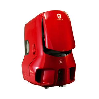
There’s a very good reason why ASUS doesn’t make cases anymore. That reason is called the Vento 3600. Available in bright red, green, or blue the Vento 3600 was marketed as an innovative chassis with cutting edge ventilation and a unique gullwing type of door. While I’m sure the jet engine appearance of the Vento helped with airflow, I’m quite happy the company is now sticking mostly to graphics cards and motherboards.
JPAC 412 Black

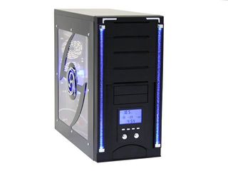
While it certainly isn’t as extreme as some of the other examples here, the JPAC 412 Black is definitely worth mentioning. The front of this case featured two vertical light bars designed to mimic the appearance of water bubbles. Also included was a LCD panel that displayed internal temperature. The only thing missing from the tacky fish tank ensemble was some fake coral on the inside.
DeepCool Steam Castle

Available in flashy red and yellow colors as well, the DeepCool Steam Castle was supposed to be a Steampunk-inspired creation. Instead, the design seemed to completely miss on the historical element and served as a great reminder for manufacturers to keep the crazy theme ideas to the talented modders.
The biggest gaming news, reviews and hardware deals
Keep up to date with the most important stories and the best deals, as picked by the PC Gamer team.
Lian Li PC-777B Snail

Lian Li may be known for some case designs that are certainly out there, and some are even simple and clean. But the snail-like PC-777B was just downright puzzling. The case was created as a 20th anniversary special product and came with a massive price tag exceeding $300. Luckily, the appearance has no effect on the speed of the internal components.
XYNOS G3

If you thought the TT Level 10 was expensive, the Xynos G3 is sure to raise some eyebrows. This $1895 absurdity is made entirely from aircraft grade aluminum and features a 7-inch display on the front of the case that can be used as an 800 x 480 extension to your desktop. It comes in red, blue, or black and also has Crysis and Call of Duty-themed editions. Even if it was the coolest looking case on the planet (it definitely isn’t), we’d have a very hard time ever justifying $1895 on any single component, let alone a case.
Cougar Challenger

The Cougar Challenger came in three exciting color schemes: orange-black, white-black, and black. The design itself was certainly out there with a lot of the other eccentric “gaming” cases we’ve seen, but the one feature and design element that brought the Challenger to a whole new level of crazy is the power button. The banner below taken from the product page speaks for itself.

We absolutely recognize that appearances are subjective and someone out there is sure to appreciate these designs a whole lot more than we do. But I for one am very happy companies like NZXT have moved towards simpler, more practical design choices. Products for PC gamers certainly don’t have to look like transformer concept art rejects. Have some other absurd “gaming” products you’d like to share? Let us know in the comments!
Most Popular

