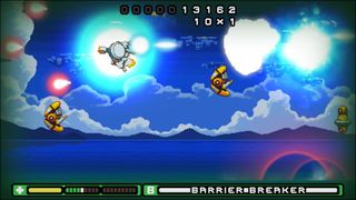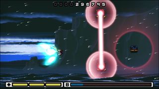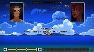
Whether you call them shmups, danmaku, or bullet hells, side-scrolling shooters are notorious for their cult followings and high difficulty. Chris Ekins of Newt Industries is making Risk System (a demo is currently available at that link) with a different approach, aiming for an audience distinct from the usual shmup enthusiast crowd. His goal is to make games anyone can play, preserving the empowering feeling of difficulty while doing as much as possible to make a game that doesn't punish failure.
He sat down with me to talk about accommodating players disabilities, teaching players to overcome challenge, and taking the sting out of setbacks.
Questions and answers have been edited for brevity and clarity.
PC Gamer: Accessibility is one of your main goals for Risk System, but accessibility means a lot of things to different people, ranging from difficulty to accommodating players' disabilities to accommodating players' unfamiliarity with the genre—or, indeed, games in general. What does accessibility mean to you?
Chris Ekins: Accessibility to me is designing in such a way that allows for as many people as possible to get the intended experience. This will vary from game to game, as some games don't involve mechanics of interaction to the same degree as others to convey their experience. For Risk System I didn't want to have a mode that subtracted content be the game's means of accessibility, instead I wanted to make it possible for as many people as I could to become an ace pilot alongside [the protagonist] Alys.
Risk System goes the anti-bullet hell route. Instead of the challenge coming from finding the safe spot the developer left on the screen, the player is encouraged to interact with projectiles
Chris Ekins
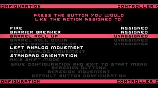
My eyes were opened most to the issue by the speedrunner halfcoordinated, who was born with hemiparesis, which limits the usage of one of his hands greatly. Due to this, he plays games with one hand and does so extremely well, but even with his dedication and skill level, there are choices that developers make that make some games unplayable to him and many others. This was where Risk System's custom control setup came from, which allows players to map movement to the right analog stick, as well as an axis shift mode that tilts the directional inputs 90 degrees to more easily accommodate one-handed play.
Other resources devs can follow and get advice from are the AbleGamers Twitter, as well as Gameaccessibilityguidelines.com.
The biggest gaming news, reviews and hardware deals
Keep up to date with the most important stories and the best deals, as picked by the PC Gamer team.

Side-scrolling shooters have a reputation for difficulty. It's right there in the name: bullet hell. Do you think that difficulty is essential to the genre?
Not the type of difficulty that has become associated with the genre, which I would describe as pedantic and very narrow. Challenge is a means of conveyance and an important one, I think it just needs to be handled much better than emulating games that were meant to simply rob you of quarters.
Bullet hell shooters are also a much more passive experience mainly centered on finding a safe spot on the screen and waiting out a timer while surrounded by thousands of bullets, Risk System goes the anti-bullet hell route. Instead of the challenge coming from finding the safe spot the developer left on the screen, the player is encouraged to interact with projectiles as getting close to them super charges the primary weapon on their ship and builds up their Barrier Breaker, a fullscreen high-damage attack.
The game over screen as we know it is kind of an artifact of older arcade culture
Chris Ekins
Players have options on how they fly through the stage and are given offensive capability boosts by self-imposed challenges and choosing to fly near enemy fire. Whereas older-styled shmups simply emphasize staying alive, the way to play Risk System best is to do whatever looks the coolest or most impressive, as taking risks is rewarded not only with a boost in offense, but [also] shield recovery pickups from enemies destroyed while performing such stunts.
Why do you think that level of difficulty has persisted, despite the fact that side-scrolling shooters haven't been arcade mainstays for decades?
I think it's still popular because the experience of gaining mastery is a compelling narrative in and of itself. It's a condensed form of the hero's journey or an underdog story that a player gets to experience on a very real level, versus simply being told it took place for the characters in that particular fiction. It is much more personal experience.

How do you design a control scheme to accommodate one-handed play?
The big notes I was advised on was to allow as much configuration as possible, and allowing use of the right analog was paramount. You want to allow for all the functions to be bunched together tightly and try to reduce the number of face buttons required to play. Originally there were three different firing modes that used three face buttons. [I] trimmed it down to one fire button and the Barrier Breaker function, which meant there the barrel rolls that are normally mapped to the shoulder bumpers could be assigned to the remaining face buttons if desired. I don't regularly play with one hand, but I personally found the most comfortable one-hand set up for me (on an Xbox One controller) was assigning fire to the right bumper, barrel rolls to X and A, and barrier breaker to Y.
The most common other disability issues facing games are color-blindness, deafness, and light-sensitive epilepsy. Have you tackled those at all?
Being partially colorblind myself, I've chosen color values that, on their luminosity and contrast levels to each other, stick out when you remove saturation. Many portions of the game that include an audio cue to telegraph an incoming attack have threat rings to help visually convey incoming damage.
The one area I regretfully am currently unable to address fully is photosensitive epilepsy. The game's original art direction was changed drastically from full 16-bit style pixel art to a hi-bit combination to allow the use of semi-transparencies versus flickering objects to simulate transparency, which was a big help. However due to current engine limitations, the game is frame locked at 60 fps, which is 30 fps short of the reduced risk safe zone. If the game does well enough to be ported to a different engine this will be changed at that time, but for now there is a warning for those with photosensitive epilepsy at the beginning of the game.
How do you preserve the experience of gaining mastery without emulating the quarter-swallowing frustration?
By foregoing many of tropes long associated with the genre and adopting more modern practices. Death in Risk System results in a quick and painless restart from a checkpoint versus being ejected to a "continue?" screen. It communicates that the game is working on the player's terms. If the player has the will to try again, they get to be put right back into the action without a protracted screen transition emphasizing that they were shot down. This is a story of a pilot that eventually triumphs against overwhelming odds, that's the player's story. The player doesn't need to be slowed down or discouraged from engaging with that story.
Most shmups have opted for ubiquity in controls and movement—ships, flying people or cats etc, all control like a mouse cursor
Chris Ekins
The game over screen as we know it is kind of an artifact of older arcade culture and often served as a sort of a broadcasting or focus on failure (though at times used at the end of a game). Mistakes are to be learned from, they're good, dwelling on a mistake or feeling a spotlight shined on one, not so much. In Risk System's case, a game over screen really wouldn't add anything thus it's difficult to say what would be missing outside maybe a short respite from the action, but there is a pause button for that.
Initially, [omitting a game over screen] was born from the first public build just not having a continue screen, but we noticed that when the game didn't give [players] the option to stop immediately, they kept playing and became increasingly bold.
Last night we had a public showing of the new demo at Indie Arcade, in Madison, WI, and the determination that would take hold in people playing for the first time was awesome to see. We ended up with a substantial line because players decided when they were done playing, they would play until they beat the first boss, which would only take a few attempts at the most. Those that beat the boss on the first attempt played until they beat the second.
In demoing the game to the public we've seen this system convert many people that were very vocally "Not into shmups" or "Not good at these kind of games" into people having fun while gaining mastery of the mechanics.
How is Risk System different from other side-scrolling shooters that involve similar grazing boosts, like eXceed?
From what I've seen of other games that have grazing mechanics, those mechanics are never really fleshed out in a way that they play to a core concept. These are typically still just bullet hell games with very restrictive, small, careful movements and the majority of game play being executed on an intended path. This extends to movement itself, the ship in Risk System (the RSK9) has handling and a distinct way that it flies. Most shmups have opted for ubiquity in controls and movement—ships, flying people or cats etc, all control like a mouse cursor regardless of what they are. The RSK9 has momentum and is swung about the screen in huge sweeping movements and there is also a trade-off in performing stunts like barrel rolls. Barrel rolls allow the player to gain vertical distance quickly but it sets them very quickly on a path they will have to steer against to correct if it brings them out of range of one threat and into another. Barrel rolls also increase the amount of energy the player absorbs if they graze during a roll and doubles their firing speed making the barrel roll an offensive technique as well as an evasive maneuver.
The game is also partially randomized which makes a huge difference, this makes it that the player is always reacting versus just memorizing. All of it circles back to encouraging the player to take risks and make choices in the moment versus adhering to a rigid or wholly intended routine.

You mentioned that the goal of accessibility is to make it so as many as people as possible can get the intended experience. What happens when the intended experience involves managing more things at once or reacting more quickly than a person is capable of? How do you reconcile an intended difficulty curve with wanting to bring the game to as many people as possible?
As many people as possible will always include an asterisk, whether it be personal taste or a physical barrier that technology/hardware hasn't allowed us to overcome yet. The idea is to do the best with what we have now and through design we can address many problems now so that when the day comes that we have better and more inclusive interfaces, the games will be there.
We have to do our best to deliver the experiences we want to while working with canvas available, which right now are keyboards and hand-held controllers.
If people are given the chance, they'll surprise themselves. What you as a developer may deem "too easy" is often the way better route. You can also present fairly steep challenge moments if you've gained the players' trust, which will result in them thinking to themselves, "I didn't see any way to possibly avoid that so there must be another thing I can do to get past this."
Sometimes presenting what seems like a brick wall is a much more effective tool for teaching than giving more than one way out of a very specific point. The second boss [at the end of the demo] provides a moment that, in order to make through, requires an understanding of one of your offensive measures having a defensive application. This application is hinted at in the story, and has been planting seeds of its potential throughout game play. Once it dawns on the player how it can be used, suddenly the world opens up. If they were still only somewhat committed to being a daredevil then, they're 100% on board now. It's actually one of my proudest moments in the game. Once the player beats the demo, they understand the mechanics at a point where they can begin mixing mechanics together and experimenting, and they will be ready to solve what is thrown at them for the rest of the game.
Most Popular

