Making a game in a weekend: Ludum Dare 19 begins

Every four months, there's an open competition to make a game in 48 hours. It's called Ludum Dare, and each competition has a theme voted on by the participants. December's contest, Ludum Dare 19, kicked off last night with a theme of Discovery . I've decided to try entering, and I'll be blogging my progress here and on the Ludum Dare site .
Day 1, 6AM
Discovery is what I was hoping for. I think one of the close runners up, Containment, would probably have led to a more interesting selection of games, but I had a clearer idea of what I'd do for Discovery. I knew if this one ended up being picked, I would have to make something involving randomised content. That's what makes Spelunky so exciting to play, and that's probably the greatest game about discovery I've ever played.

Unfortunately I'm not Derek Yu, and I only have 42 hours, and I'm wasting time writing a blog. So my game will be a little less ambitious.
To fit the theme, I feel like the pleasure of the game has to have something to do with the discovering. And the only thing gamers truly and instinctively care about is stuff that benefits them in the game. So not only does it have to be the content rather than just the scenery that is randomised, the unique elements of that content have to feed back into character progression in some way.
My plan currently is for something top down, where you direct your character - probably a robot - around a large landscape with the mouse, encountering enemies with randomised stats. Destroying them will let you salvage some of their traits, so a very tough enemy would boost your hitpoints when you destroy it.
Someone on the Ludum Dare site joked that everyone should not only have to stick to the chosen theme, but also combine it with Christmas. So if I can draw it in any meaningful way, I'll set my game in the snow.
Day 1, 8AM
I present to you, SnowBot! So called because the only things I have made for it so far are some snow and a robot.
The biggest gaming news, reviews and hardware deals
Keep up to date with the most important stories and the best deals, as picked by the PC Gamer team.
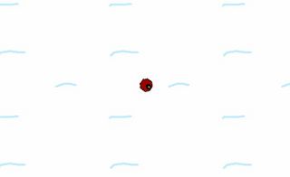
It is the ugliest game ever made, but it works - the robot chases your cursor while you hold the mouse button, and decelerates when you release it.
Obviously with 48 hours to make something, you start to look at what really takes time, and the answer is invariably 'tweaking'. So I made a pact with myself: no tweaking till the game is virtually done: of graphics, movement, controls, anything. I'm allowed to change things once or twice to get them functional, then they're set in stone until the rest of the thing is in place.
I have two days, so my plan is to make the game in one. That way I can spend the second day making it good, or making up for how badly I failed to meet this ridiculous deadline on the first. My game is going to be crude and ugly no matter what, so I'm happy to make it even cruder and uglier to give myself some time to balance it and make it more fun.
In my head, this meant getting a character moving around the world in the morning, then making content in the afternoon. Turns out the first part only really took an hour, two with all the faffing with all the blogging and setting up screen captures for the time-lapse video I'm hoping to make of this process.
So next up is putting an enemy in the world, and letting the two shoot each other. Video games.
Day 1, 1PM
Two surprising things have happened: firstly, I've made a game that works already. There's no point in playing it yet, since it does nothing interesting, but that was all I hoped to achieve today. This'll give me time to make it interesting today, and make it good tomorrow.
Secondly, now that I've made enough of it to see what it's going to be like, I realise it has almost nothing to do with the theme. The angry deathbots you meet aren't randomised yet, but even once they are I think running into them is just going to feel like encountering enemies in an arena. It technically is discovery, but because they're simply off-screen rather than visibly obfuscated, it's not going to feel like it.
I'm not going to worry about that too much yet - my priority order is to make it interesting, then make it good, then make it fit the theme. Here's what it looks like now:
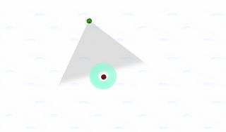
The blue circles are shields: I didn't fancy putting a bunch of work in just to recreate the conventional hitpoint bar or health meter on your interface, so I went for something more visual and in-fiction. Right now each shield takes one hit, but as you can see that makes you impractically large for not much health, so I'll probably tighten their size and thickness before I'm done, and perhaps make them come back online a while after they're taken out.
The enemy will have these as well, and they're one of the things that'll be randomised, so it'll be very obvious when you're facing something tough. Not sure if I'll also have big hulls - that'd mean introducing an armour system as well, which may defeat the point of the shields.
I do plan to have large engines/tracks for fast bots, and a large turret or power core of some kind for things with a lot of firepower. Basically, if I can have at least three functionally important metrics that enemies can vary in, and make each one visually readable at a glance without any interface, I'll be close to what I want.
Challenges right now:
- You're in a fairly large open field of snow, and I'm not sure where to take the environments from there. I'd love it to be infinite but that's technically tricky. I'd also love some randomly placed obstacles, but I'm wary of creating much art work for myself - I want time to redo the actual robots.
- My control method didn't work: holding the mouse button to make your bot chase it was fun, but it meant you'd never be able to fire in one direction while moving in another. I've changed it to Cannon Fodder controls - click to move, right click to shoot somewhere else while you're on your way. It doesn't feel quite right with current movement speed and screen size - you're at your destination before you've got more than a couple of shots off. May rethink.
- Random enemy movement was trickier than I thought. I've done it, but they're rather geriatric: quivering with indecision when deciding where to move. I've realised the way to make it look better is have them pick an arbitrary direction, turn, then move. But that's also the way every other game does it, so I'm still wondering if there's a more interesting way.
Title ideas: Sighs of the Snowbots? Snowbot Snores?
Day 1, 11PM: Almost Fun
The screenshot I'm about to show you won't look spectacularly different to the one earlier - I still haven't fixed the horrible protagonist bot or the laughable kid's snow effect. But to play, it's already close to what the finished game will be.
The main thing is randomised enemies, with visually apparent stats. Randomisation will be part of the Discovery element, and also just the fun of the game: it's never going to be a great shooter, but it's already kind of cool to blunder into a triple-barreled deathbot with hyper speed and discover a whole new echelon of boned.
The visual apparency - representing every stat in the shape of the enemy rather than a stats readout - is part of that too. It gives your read on the enemies immediacy, and that's a catalyst for fun. I need all of those I can get. Hopefully you can tell which one of these enemies has more firepower, and which one is better protected.
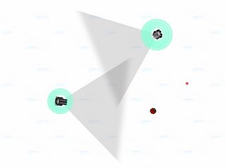
What you can't see, and what you probably won't even find if you play it, is the ridiculous amount of fun I'm having with it.
Most of this afternoon was spent thrashing out the enemy movement to be more convincing and dangerous, and all of this evening was spent drawing just a few bad sprites - it takes me actual time to get pixel art to the dismal level of quality you see here.
Then in less than half an hour, I did the coding legwork to implement every chunk of art into modularly assembled, dynamically scaled, randomised deathbots. And the game's gone from being a tame arena where I can always win through knowing the tricks, to a terrifying robot safari where things with crazy muzzle velocities can also outrun me, and I see combinations I hadn't pictured.
It's not exactly good, yet, but it's an amazing thrill to see that kind of stuff come to life from a few simple maths statements. I can pretty much stomach art work if it's for a game that can stretch and recombine it to endless different purposes.
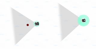
I've also had an idea for how to relate the game more obviously to the Discovery theme. It's fun to try and creep up on these bots when they're not looking. They turn round if you shoot them, to prevent the game being too easy, but I'm going to make it so that you can subtly scan them if you get up close and undetected.
If they have a module you've never used before, you'll gain the ability to salvage it if you later kill the bot. And if they don't, you'll be able to read their robo-thoughts. Not entirely sure what I'm going to do with that, but even if it's just an array of pointless introspection it should be fun to write.
Day 2, 1PM: Feature Complete
Which is to say: not graphics or content complete. So brace yourself for a painfully similar screenshot:
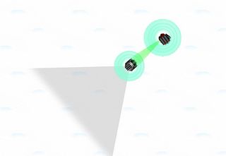
But the two tiny changes you do see represent pretty much everything else I needed to get done for the game to make sense: you can now scan enemies when they're not looking to steal the details of their weapons, then use that info to rebuild their guns, shields and engines when they're dead.
I'm happy I've got to this point, but there's a lot more to do. I have a choice of a few fairly major areas to work on, and I'll list them in my current priority order:
- Player guidance: Even in an ultra quick experimental game I don't think this step is remotely skippable. If I don't get a few basic tutorial messages in to explain how to play the game, no amount of readmes will ever make up for it.
- Balance: Bots of random strength spawn in random positions. So that kinda sucks. I just need a few lines of code to make weaker ones spawn near the player, tougher ones further away, and to make certain configurations excitingly rare. This'll have a big effect on how much fun it is to play.
- Environment: I'd like to add water around the edges to make this an island, and possibly a fortress wall at the top.
- Objective: Right now there's no long term objective. Ideally I'd like to have you scanning and stealing parts until you're strong enough to assualt a fortified wall to the north and escape.
- Graphics: I must at least make some proper plasma blasts, and ideally add explosion effects and a better player bot. I also need to take one more go at making snow look less awful - I'd like to make it grainy and randomise the 'dunes' a bit.
- Extra feature: scale. I'd really like to have double- and half-size bots roaming around, with accordingly different toughness and speed.
The reason graphics is so low is that the time it takes is such a wildcard - sometimes I get something bad right away, other times it takes me hours to make something bad.
Let me know if you think my priority order is nuts.
Current title idea: Scanno Domini . Other scan puns welcome.
Day 2, 1:55AM
Jeeesus. Five minutes to go, and my game is zipped up and submitted. Grab it here . Feels strange and amazing to be 'done' with something - I've tinkered around with games for months without getting to a point I'm happy with. And while there are a few items not grayed out on my Scanno to do list, I did much more than I ever thought I could in two days. And I actually have fun playing the result.
Rather embarrassed about Gunpoint now. It could probably be done in a week.
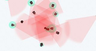
The finished game is pretty much what I planned: a top-down shooter with randomised enemies, whose randomised bits you can steal for yourself. I didn't end up scaling much dynamically, except the gun sizes. I couldn't find a way to make it look right in the time, so it was quicker - even for me - to draw a few engine and weapon types. The differences are more immediately interesting, too - "Ooh, blue plasma?"

Number one thing that went right was definitely time management. I had two days, so I picked something I thought I might just about be able to do in one. It was done in one and a half, so I had that crucial half day to take a working concept, find the fun, and make the game about that.
I don't know if I actually made it fun, but it's so much closer than it would have been if I'd picked a more ambitious idea and only just got the basics hammered out. This is my first finished game, and given the time limit I thought I'd end up with something a lot more half-baked.
It is buggy, and its tutorial is just gibberish, but in an ideal circumstance it's conceivable that it could convey to you what you need to know. Oh, except that you have to press R to restart.
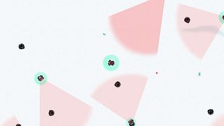
Thing that went least well was trouble shooting. I'm rarely good at this, but on the scanning ray in particular I just went out of my mind. It's still buggy - won't always scan everything there is to scan on your first scan - and I may have messed up other things in the last minute fixes.
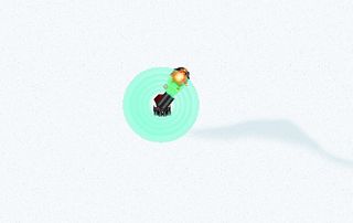
I said I was going to leave graphics till last, but in the end I decided it was worth a stab at them if I gave myself a hard time limit. I basically managed to turn the visuals from offensively ugly to merely very crude. I'm OK with crude. There's just a particular look to very bad graphics that's not endearing or ignorable or in any way OK, and I had to try to avoid that.
I also took time to put in sounds for almost everything important, and I'm really glad I did. I knew they'd be important to the feel, but I didn't quite appreciate how important the feel would be to the overall thing. It's not an art game, it's not very brave or inventive, so it really needs to have some decent 'pew pew!'s in.
I have exactly no time tomorrow to polish this up and also submit it to the jam, the less strict contest that gives an extra day. Which is a shame, because it needs a few bandages to hold it together properly, and a few basic human rights like a choice of resolutions. I will do those things, just not right away. For now, I am done. Thanks for reading.
Most Popular


