How does the Deus Ex Revision mod improve the original?
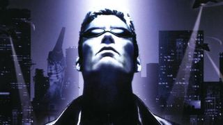
The Deus Ex Revision mod will be released in a few hours. Described on its ModDB page as a "large scale re-imagining" of Ion Storm's Deus Ex, it overhauls the original with new lighting, improved textures a remastered soundtrack.
"We also bundle in some of the best enhancements the community has to offer: high-detail textures and models, Direct3D 9 rendering, and alternate gameplay modes," says project creative director John French, via a statement put out by Eidos Montreal. The Mankind Divided publisher is officially endorsing the mod, which has been in production for seven years, according to updates on their ModDB page.
You can download the mod at 6:30PM BST / 10AM PST for free via its Steam page. I jumped into the original and a preview build of the Revision mod earlier today to take a few comparison screenshots, which you can scroll through above.
Deus Ex: Game of the Year Edition and Human Revolution will be on sale from today through to October 16 at 80% off as part of the Steam Stealth Sale.
The original opening moments of Deus Ex have been destroyed for me entirely by the Deus Ex recut, Watch that and then try to sit through Deus Ex' intro without cracking a smile.
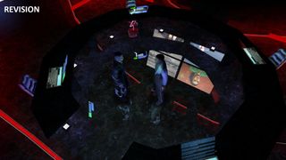
Voila! Very nice, but the screens replace the globe part of the Illuminati's huge-claw-clutching-the-planet statue—a high point in ostentatious evil organisation furniture design.
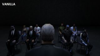
Here's an electronic old man, ruling the future, in relative darkness. Many of the wall textures have been improved to look craggier. It's particularly obvious in the opening, which sees the camera pan past a bunch of slum walls.
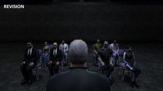
Oh good, someone turned a light on.
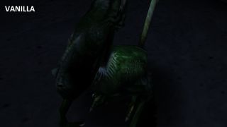
I'm glad that the new Deus Ex games haven't brought back the annoying Greasel, or Deus Ex' other odd monsters, the Gray and the Karkian. This captive greasel lingers in a dark concrete jail.
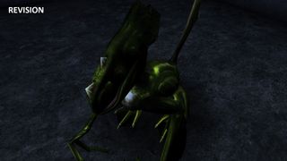
Fixed. Never has a Greasel looked so fine.
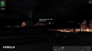
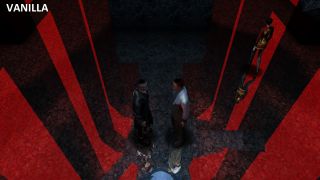
The low resolution of the year 2000 original meant you could get away with low-fi skyboxes like the city in the background here. On modern monitors it takes on a strange, blobby appearance.
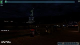
The skybox has been up-rezzed and the lighting rearranged to give the simple geometry around the statue some extra colour. It is still super-dark, though.
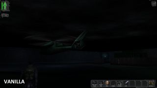
I guess you don't need good lighting when everyone's vision is augmented. Still, this comparison shows how the addition of just a few coloured lights can make a scene easier to discern.
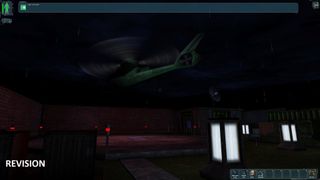
Some areas in the opening section have received more attention than others, but there is a significant amount of extra geometry in the Revision build. In this shot you can see some extra light pillars and crates, and there are significant differences at other points in the intro—the brief Paris shootout moment has been completely revamped, for example. From the official mod shots, it looks like similar attention to detail will continue throughout other areas. It's as good an excuse as you could hope for to revisit the classic.

Part of the UK team, Tom was with PC Gamer at the very beginning of the website's launch—first as a news writer, and then as online editor until his departure in 2020. His specialties are strategy games, action RPGs, hack ‘n slash games, digital card games… basically anything that he can fit on a hard drive. His final boss form is Deckard Cain.
Most Popular

