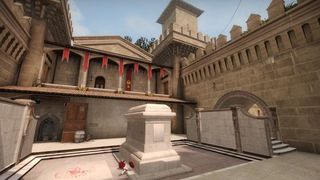
Building Crown is a three part series from mapmaker Shawn " FMPONE ” Snelling and pro Counter-Strike player/mapmaker Sal " VOLCANO " Garozzo, revealing the inspiration and building process for their map Crown. Their goal with Crown is simple: build the best competitive Counter-Strike map ever. In part three, Snelling talks about iteration in map design and listening to community feedback to improve Crown.
Releasing de_crown has been a fascinating experience for Volcano and I. When we decided Crown was ready for broader community testing, we released the first public build with the same mixture of anxiety and excitement that always accompanies a new map release. Thankfully, the launch went smoothly! Crown received over 1000 favorites in its first week on the map workshop (the highest rated map on the workshop is over a year old, and has about 1500). Crown ranked within the top five maps of all time virtually overnight. Crown was also the most played map on AltPug's community Matchmaking service during that time period, and the feedback we received there was generally positive.
The community was engaged, but Counter-Strike fans are used to playing high quality, nuanced maps with years of competitive polish. This is a high standard for any brand new map to compete with. Not all the news was positive. In public beta testing, several issues were identified which needed fixing, some of which—such as the addition of a new path—would require major surgery.


Generally speaking, I find that that the most effective feedback happens during a dialogue. I like to turn players into problem solvers, since many folks already have brilliant, innovative solutions in mind which I might never have considered.
As a result of one such discussion, we added a trick jump to Crown, which you can see below. This trick jump, though easy enough to implement, added a nice layer of richness to the B-Bombsite—it's challenging to make the jump successfully, but will allow skilled players to go from “lower B” to “upper B” in seconds flat.

What are people REALLY saying?
Volcano and I participated in playtests and spectated matches anonymously in order to understand how players really felt about Crown, because people typically temper their criticism somewhat when they know they're in the same server as a map creator. We heard lots of people saying Crown felt big and too open, so we added more horizontal details at eye-level and new architectural features designed to bring the map down to scale, in addition to reducing or closing several sightlines. A lot of times, making these gameplay adjustments is positive aesthetically, too: the map feels a lot more natural now.
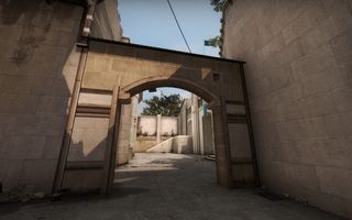
We also got tons of great feedback about Crown on Reddit. A few common themes about Crown which popped up on r/globaloffensive were that the map's rotation times were too long, the lack of a middle-connector was creating static gameplay, and the map's balance seemed T-sided. It was important for us to immediately make changes to fix these issues.
The biggest gaming news, reviews and hardware deals
Keep up to date with the most important stories and the best deals, as picked by the PC Gamer team.
In many instances people took to Photoshop to actually illustrate how they wanted to see us implement the new changes (another example of how the community already has solutions in mind), and these illustrations were frequently very similar to one another, indicating that a consensus had formed.
Already Pro
Because Volcano is a professional Counter-Strike player in addition to being a level designer, pro feedback is cooked into Crown very deeply. I believe that Volcano and I make a great team because we know that if the other person raises an issue, that he speaks on behalf of a large segment of the community. I consider priority one of my job asking Volcano about the competitive repercussions of every design decision we initiate: leaving this window open vs. closed, the readability of this area, whether this area needs more cover, and so on.
The community was widely requesting a new path cutting from “middle” to “CT courtyard” due to lengthy rotation times and Volcano also felt that this was a necessary change to make. My stance was that I was satisfied with how Crown was playing, and that proper team coordination would give CT's enough time to rotate, especially once people were more familiar with the map. Volcano didn't necessarily disagree, but he was pretty certain that the community would be happier if we implemented the change, and that not implementing the change could ultimately limit Crown's variety in competitive play.
We had considered such a path early on in Crown's gray-box stage, but decided not to implement the path back then because we wanted to emphasize identifying fakes and making timely call-outs about what the Terrorists were doing. As it happened, the community didn't love the lengthened rotation times, perhaps because rotating places huge emphasis on the teamplay aspect of Counter-Strike, but truly relying on your teammates can be frustrating outside of a tournament-style setting.
I personally enjoyed the way Crown was playing, but sometimes as a mapper you have to accept that your personal preference might be in the minority. Sometimes you have to give the people what they want. Because Volcano was adamant that this was the right thing to do, because shortening rotation times was going to make the community happy, and because it would positively impact gameplay for players at all skill levels (especially in less formal settings like matchmaking), we implemented the new path.
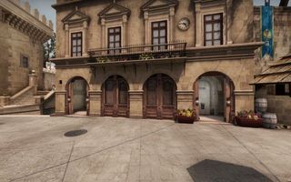
The Ripple Effect
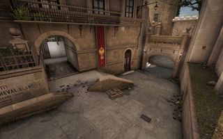
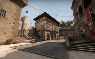
When major changes are made, other areas typically have to be adjusted to accommodate them. Here you can see the ripple effect the new path has already had.
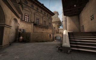
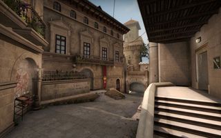
We received some feedback that this sniper's nest felt overly large, out of place, and sort of pointless. Adding our new path mitigated those concerns.
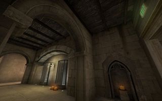
We also needed to adjust the Armory area. We were told by Valve that Crown could benefit from some more lighting variety, and layout considerations required closing one of the walls in this area. Details like candles added some visual interest and narrative to the map while helping to sell the new changes.
Removing all vents was a top priority for us, because they hindered free and easy movement along Crown's various paths:
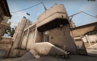
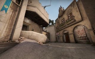
Here, much like on de_cache, players only need to jump one time in order to swiftly reach higher elevation at Middle.
We also added a well to CT Courtyard, giving players some minimal cover, helping the map's scale, and livening up the area.

Crown Continues
All in all, major surgery on Crown is now complete, but your feedback is still invaluable. If it weren't for the community, Crown might not have matured so much post-release. You made your voices heard, and Volcano and I were listening.
Check out the next page for a photographic tour of Crown's full evolution, from the blocky gray-box it once was, to the shippable, polished map it is now. We hope you continue to let us know how we're doing. Most importantly, we hope you enjoy the newly updated Crown when its big update goes live on the workshop very soon!
PC Gamer is the global authority on PC games—starting in 1993 with the magazine, and then in 2010 with this website you're currently reading. We have writers across the US, Canada, UK and Australia, who you can read about here.
Most Popular


